Congratulations to everyone who submitted haiga for the Echidna Tracks collection. We were encouraged by the number of submissions ‒ 43 in all, from 26 entrants. There were a few collaborations, but most of the haiga were from a single artist. The most popular form was the shahai, or a haiku embedded in a photo. There were also a number of skilled traditional entries, using either hand drawn or digitally drawn images. We have picked the best entries from each of these three categories, plus one highly commended shahai.
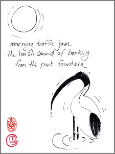
Traditional, hand drawn: Ron C. Moss, “morning traffic jam”
Judges’ comments
Marietta McGregor
One aspect of humour in haiku as suggested by British poet David Cobb may be derived from incongruity and contrast. Lines 1 and 2 of the haiku call to mind peak hour in the city with frayed commuters only too ready to hit their car horns. The reader imagines the cacophony of city streets. Line 3 takes us somewhere unexpected, to a park fountain. There, we find not commuters but a bird very familiar in cities, the Australian White Ibis, gathering with mates before an onslaught on lunches. The bird isn’t named, but is hinted at by its call. We learn the source from the image. This whimsical haiku is unusual in that it has 16 syllables, but still works with no syllable wasted. The sumi-e sketch is lightly handled. Lettering and chop combine for a well-balanced piece.
Julia Wakefield
If I didn’t live in Australia I might not have understood the haiku on its own. But this competition is about Australian haiga, so it is definitely acceptable. The whole piece has humour, good design, excellent artistic execution, plus an ‘aha’ moment that is reinforced by the image. The hand lettering is skilful and blends successfully with the style of the brush/ink drawing. There is a satisfying balance of black line and white space, and the feeling of movement adds yet another desirable quality for a traditional haiga. Ron’s artistic skill would convey no advantage without the additional factor of a good sense of design. The red chop is sensitively placed and demonstrates how a signature can be aesthetically pleasing.
shahai, or haiku twinned with photo: Wanda Amos, “long days . . .”

Judges’ comments
Marietta McGregor
Allusive haiga often work because they evoke different emotions in the reader, lending a poem greater depth of meaning. The two ravens in this haiga call to mind multiple allusions. They’re clever, social birds, and are said to recognise the death of one of their kind. They’re also associated in classical literature with mourning, ill omen and perhaps even prophecy. The ellipsis in Line 1 signals a longer pause, emphasising drawn-out days. Assonance is used effectively to slow the pace, with the long ‘a’s in Lines 1 and 3, and other long vowel sounds. I think the haiga works well as regards juxtaposition of poem and image. The image is well-balanced and unadorned, hinting at a silent ‘communication’ between the birds. The text picks up the colour of the leaves and the birds are set in such a way that their position bookmarks the haiku, leading the eye down to the words. The dichromatic palette is sombre, and is appropriate for the haiku’s tone of resigned acceptance.
Julia Wakefield
This haiga demonstrates an understanding of appropriate use of digital enhancement techniques. The dichromatic colour scheme reflects the mood of the haiku. Black, like the crow itself, is associated with death and mourning, but the orange of the leaves and the typeface signify warmth and comfort. The central placement of the text on the image is effective without being too dominant.
The haiku works well on its own. The words ‘stroking’ and breathing’ evoke a gentle rhythm that encourages us to accept the inevitable rather than try to fight it. The subject of the image does not directly refer to the haiku but widens its scope and adds a touch of quiet humour. The crows could be having a conversation, perhaps about the meaning of life. Poem and image talk to each other, rather than one merely reflecting the other. Wanda’s signature is suitably muted.
Highly Commended shahai: Simon Hanson, “the close of day”

Judges’ comments
Marietta McGregor
The monoku form suits this poem as it can be read several ways with a central pause. There’s a pleasing contrast of scale within the imagery, from the vastness and distance of the setting sun juxtaposed with the close-up view of a fading dandelion clock in the foreground. Centralising the image and haiku work well, with the eye being drawn to the sun. Font choice, style and position all provide balance and don’t distract from the reflective, low-key feel of the image. The haiga evokes thoughts of impermanence and change, but reassures us that joy may be found in simple things.
Julia Wakefield
The use of the monoku form prevents ‘the close of day’ from feeling too final. We are made aware that Nature’s cycle is about renewal as well as decay. The haiku leaves the ‘miracles’ to the imagination, but the image also opens our imagination to different ideas, such as the very fragility of a dandelion seed, and the way the setting sun can be framed within the crown of a dandelion. The vertical format is appropriate, as it focuses our attention on the central image.
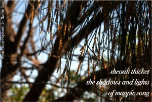
Collaboration: Louise Hopewell (haiku) and Natalie Dash (art), “sheoak thicket”
Judges’ comments
Marietta McGregor
We’re shown a close-up of branchlets not the trees themselves which allows us to picture the thicket. The haiku synaesthetically transforms a visual image into sound, while the vertical lights/darks and muted colour shading of the photograph evoke the rise and fall of a magpie’s softly melodious warbling. The right-justified line placement works with the asymmetrical image. The author names running up the side edge are a bit distracting and should be in same font as haiku, but otherwise this one works well.
Julia Wakefield
The mix of image and sound in the haiku is conveyed by the light and dark notes of the magpie’s song. The closeup of the she oaks in the image zooms us into the middle of the clump of trees that is described in the haiku. The fly/bee could be another sound to add to the mix! The pendulous fronds and the flying insect evoke a sense of movement. The text is thoughtfully placed in the darkest corner of the picture: it could work even better in a slightly smaller font. The signatures are slightly distracting and might have been better placed horizontally in the bottom left-hand corner, or could have been left out altogether.
Overall comments
Many of the Haiga submitted contained beautiful images and excellent haiku, but the biggest challenge in creating a Haiga is to achieve a satisfying sense of fusoku-furi, that enables each element to both shine on its own and comment on the other element, without directly describing or illustrating it. In our view the four selected haiga excelled in this regard.
Haiga Archive
Our haiga collections will be stored here

Congratulations Julia and Marietta on the launch of Echidna Tracks Haiga Collection. I really enjoyed the variety and depth in today’s selection and appreciate the comments accompanying them, all of which i found especially insightful… thank you
all the best
Simon
LikeLiked by 2 people